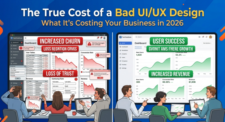
Bad design is not just an aesthetic problem. It is a revenue problem.
Every time a potential client lands on your website or opens your app and runs into a confusing layout, a slow-loading page, or a checkout flow that makes no sense, they leave. Most of them never come back. And almost none of them tell you why.
This article breaks down exactly what poor UI/UX design costs your business in 2026 — across conversions, retention, support overhead, and brand trust — and what you can actually do about it.
What “Bad UI/UX” Actually Means
Bad design is not always ugly. Sometimes it looks fine on the surface but falls apart in the details that matter most to real people trying to get something done.
Common signs of poor UI/UX include:
- Navigation that forces people to guess where to go next
- Forms with too many fields or unclear error messages
- Mobile layouts that break or require horizontal scrolling
- Slow load times from unoptimized assets
- Inconsistent visual hierarchy that buries key actions
- Checkout or sign-up flows with unnecessary friction
Each of these is a point where your business loses someone. Add them up across a month and you are looking at a measurable, ongoing drain on growth.
The Direct Cost: Lost Conversions
This is the most immediate damage. When your website or app creates friction, fewer people complete the action you need them to take — whether that is making a purchase, submitting a form, or booking a call.
Research consistently shows that even small UI/UX improvements can produce meaningful lifts in conversion rates. The inverse is equally true: a confusing interface suppresses conversions in ways that are hard to trace without proper analytics in place.
For a mid-market eCommerce business, even a 1% drop in conversion rate across meaningful traffic volume means real revenue left on the table every single month. Multiply that over a year and the cost of bad design becomes very concrete.
If your eCommerce platform was built quickly, patched together from templates, or handed off by a vendor who prioritized speed over experience, there is a good chance friction is quietly costing you sales right now.
The Hidden Cost: Support Volume and Internal Waste
Poor UI/UX does not just affect your clients. It affects your team.
When an interface is unclear, people ask for help. That means more support tickets, more customer service calls, more time spent explaining things that a well-designed experience would have made obvious. For businesses running internal tools or ERP systems, this compounds fast.
An operations team working inside a poorly designed system makes more errors, takes longer to complete tasks, and builds workarounds that create new problems downstream. That is not a technology failure — it is a design failure with a real operational price tag.
If your team is burning time on manual workarounds, or your support inbox keeps filling up with the same questions, the interface is part of the problem.
The Long-Term Cost: Brand Trust and Retention
People form impressions fast. A confusing or visually inconsistent experience signals that your business is not paying attention — and that perception sticks.
For B2B companies, this matters even more. Your website or app is often the first real interaction a prospect has with how you operate. A poor experience raises doubt before a single conversation happens.
Retention takes a similar hit. Clients who struggle to use your platform, portal, or app are more likely to churn, less likely to refer others, and less likely to grow their relationship with you. Good design keeps people. Bad design quietly pushes them away.
The Compounding Cost: Redesign Debt
This is the part most businesses underestimate. The longer you wait to fix a bad design, the more expensive the fix becomes.
When design problems are baked into an early build, they tend to spread. Navigation patterns get replicated across pages. Broken flows get patched over. New features get stacked on top of a flawed foundation. By the time the problem is obvious enough to act on, the scope of the redesign is far larger than it would have been if design had been done right from the start.
This is why investing in UI/UX at the beginning of a project — not as an afterthought — produces better outcomes and lower total cost over time.
What Good UI/UX Design Actually Delivers
The goal of strong UI/UX design is not to make things look nice. It is to make the right action easy and obvious for the person taking it.
Good design:
- Reduces the time it takes someone to complete a task
- Increases the percentage of people who complete key actions
- Lowers support volume by making the interface self-explanatory
- Builds trust through consistency and clarity
- Makes your product easier to scale without rebuilding from scratch
These are measurable outcomes. They show up in conversion data, support ticket volume, session length, and churn rate. When design is treated as a business function rather than a visual one, the return is clear.
How TYK Approaches UI/UX Design
At TechYouKnow, UI/UX design is not a deliverable bolted onto the end of a project. It is built into the process from day one.
Every engagement runs through the Analyze, Implement, Optimize framework. During the Analyze phase, the team maps out how real people will interact with the product, which actions matter most, and where friction is likely to appear. That work shapes every design and development decision that follows.
During Implement, design and development move together — no hand-off gap where a design file gets passed to a developer who interprets it differently. The team builds what was designed, with the intended experience intact.
Optimize is where the work gets sharper. After launch, the team looks at how people actually use the product and makes targeted improvements based on real behavior, not assumptions.
This is how TYK has built products for clients across industries — from the Smodin writing platform to a healthcare mobile app to the Vibe Marketing project. The work is documented at techyouknow.com/case-studies.
When to Act on a Design Problem
If any of the following are true for your business right now, bad UI/UX is already affecting your results:
- Your bounce rate is high but traffic quality is not the issue
- Clients or prospects have mentioned that your site or app is confusing
- Your team has built workarounds inside your internal tools
- You have added features but conversion or engagement has not improved
- Your mobile experience is significantly worse than desktop
These are not edge cases. They are common patterns in businesses that built fast and deferred the design work. The good news is that they are fixable — and fixing them produces results you can measure.
FAQs
What is the cost of bad UX design for a mid-market business?
It varies, but the impact shows up across conversion rates, support volume, team productivity, and client retention — all of which have a measurable dollar value. Even small friction points in a high-traffic product or internal tool can add up to significant losses over a year.
How do I know if my UI/UX design is hurting my conversions?
Start with your analytics. High bounce rates, low form completion rates, short session times, and repeated support questions about the same tasks are all signals that the interface is creating friction. A UX audit can identify the specific points where people are dropping off.
Is UI/UX design only relevant for consumer-facing products?
No. Internal tools, ERP systems, and client portals all benefit from strong UI/UX design. Poor design in internal tools leads to errors, slower task completion, and higher training costs. The same principles apply whether the audience is a customer or an employee.
What is the difference between UI design and UX design?
UX (user experience) design focuses on the overall flow and logic of how someone moves through a product to complete a task. UI (user interface) design focuses on the visual and interactive elements — buttons, typography, layout, color. Both matter. Good UX with poor UI creates a functional but unpolished experience. Good UI with poor UX looks nice but frustrates people.
How much does it cost to fix bad UI/UX design?
It depends on how deeply the problem is embedded in the product. A surface-level visual refresh costs less than a structural redesign. The earlier you address design problems, the less expensive the fix. Waiting typically increases both the scope and the cost.
Can good UI/UX design improve SEO?
Yes, indirectly. Search engines factor in signals like page load speed, mobile usability, bounce rate, and time on page — all of which are influenced by design quality. A well-designed experience keeps people engaged longer and reduces the signals that tell search engines your content is not meeting expectations.
How long does a UI/UX redesign typically take?
It depends on the size and complexity of the product. A focused redesign of a key flow or page can take a few weeks. A full product redesign for a complex platform takes longer. The right agency will give you a clear timeline after understanding the scope — not before.
Fix the Design. Fix the Numbers.
Bad UI/UX is not a cosmetic issue you can address later. It is a business performance issue that compounds the longer it goes unaddressed. Lost conversions, higher support costs, weaker retention, and growing redesign debt are the real price of getting design wrong.
If your current product, website, or internal tool is creating friction for the people who use it, that friction is costing you money right now.
Book a free consultation with TechYouKnow to identify where your design is working against you — and what a focused UI/UX improvement would actually deliver for your business.